THE TAHOE GAL
CASE STUDY
The Tahoe Gal - Brand Redesign
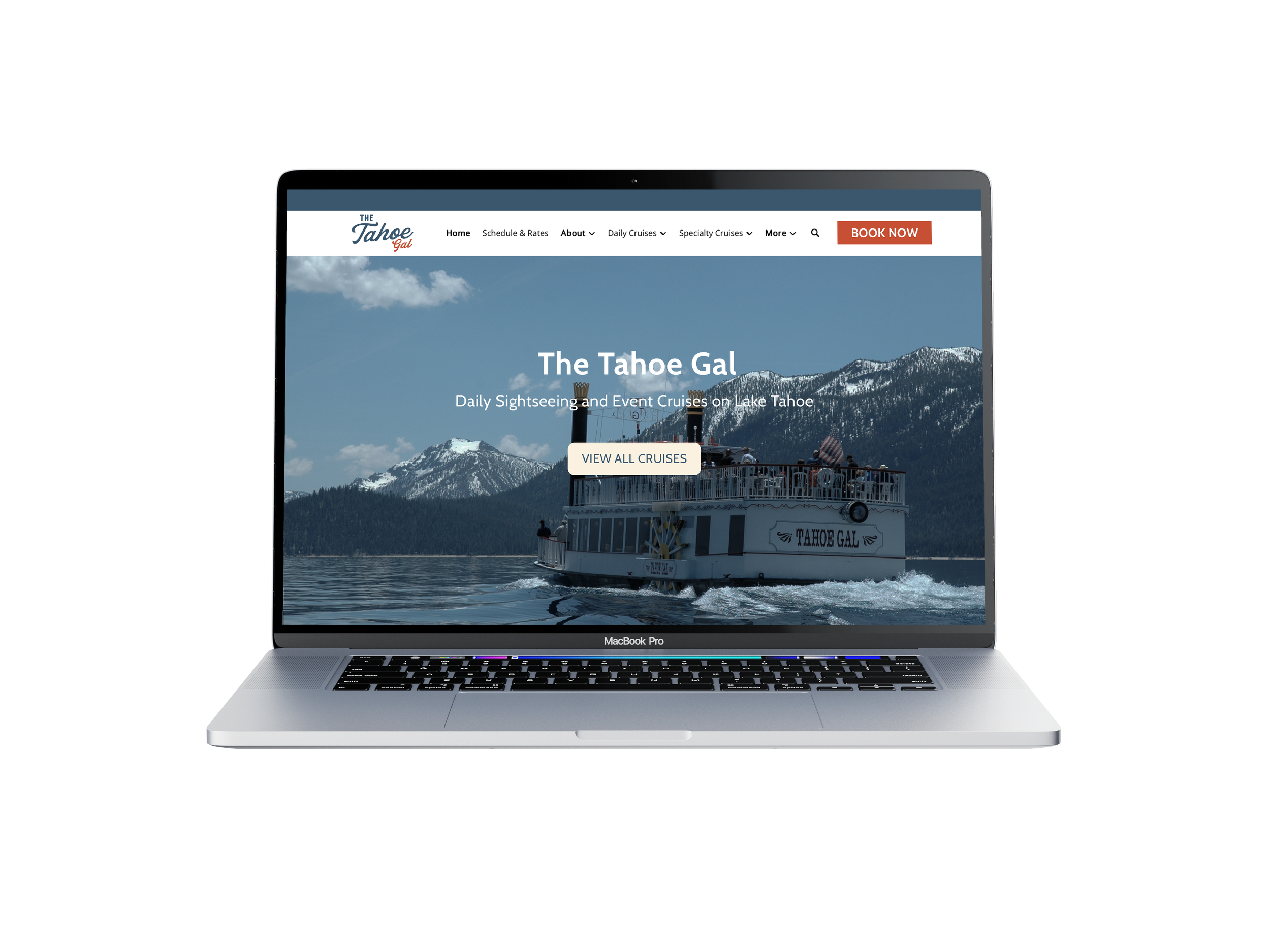
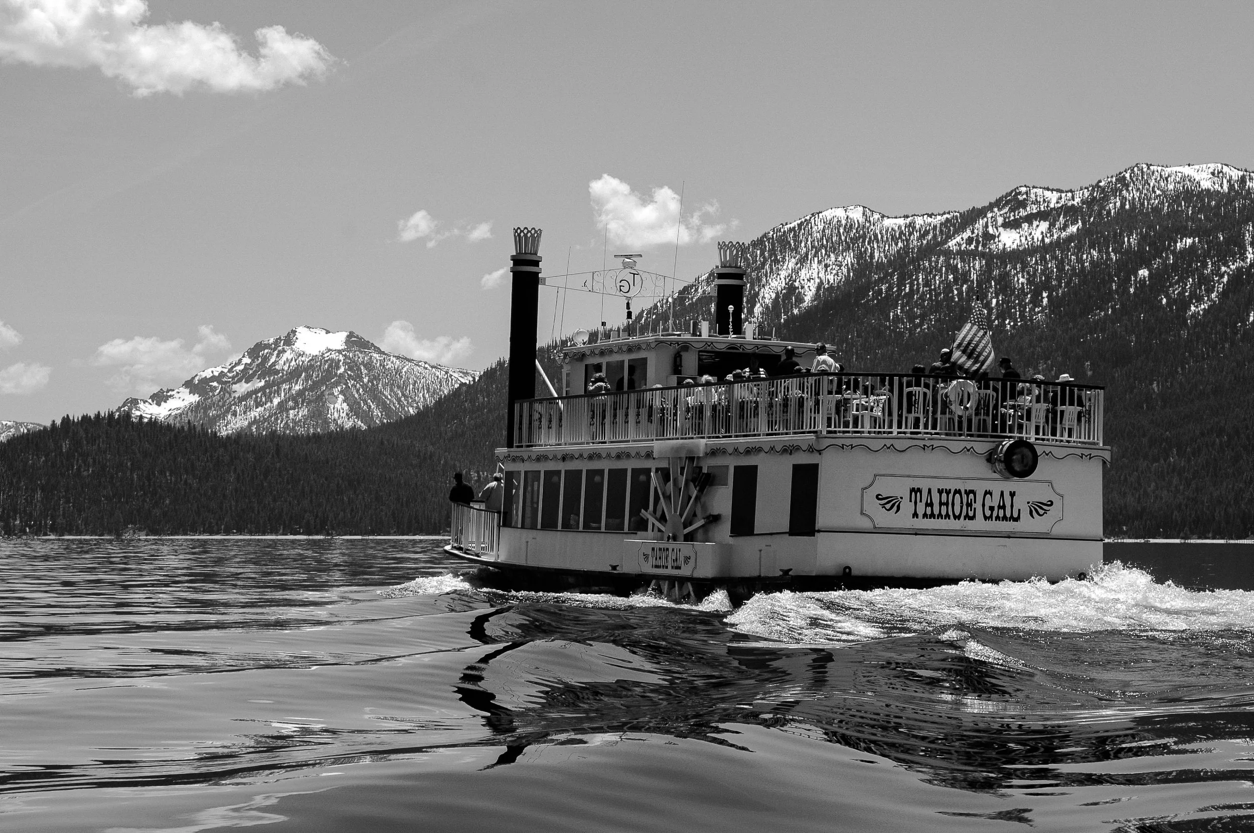
Overview: The Tahoe Gal is a large passenger tour boat located in Lake Tahoe California. I connected with the owner who had recently purchased the company and wanted to give the brand a new look to reflect the new energy and future vision of the brand. Initially they had very little branding at all, no visual consistency and appealed to an older demographic which was not aligned with the target audience they wanted.
Services Provided:
-
Complete visual identity system consisting of brand assets, strategy and a brand guidelines document.
-
A in-depth brand strategy workshop to dive deep answering fundamental questions relating to the brands reason for existing.
-
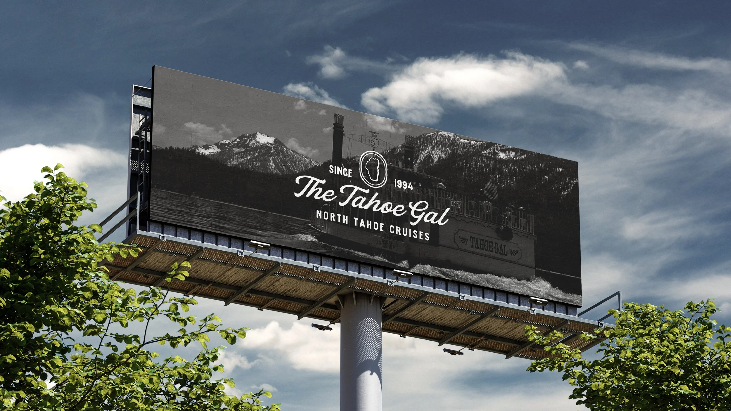
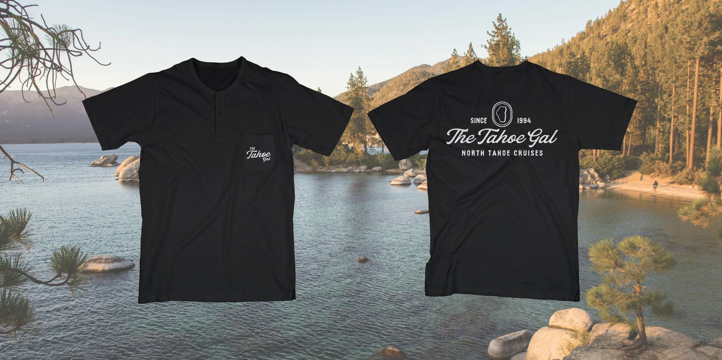
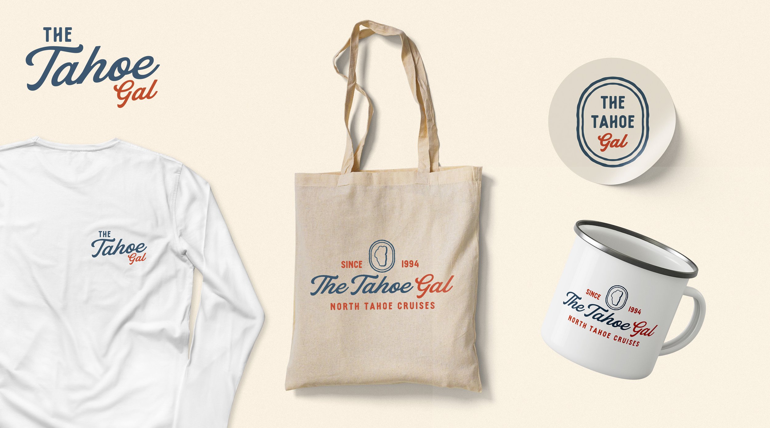
Logo’s and variations to apply to various different platforms.
-
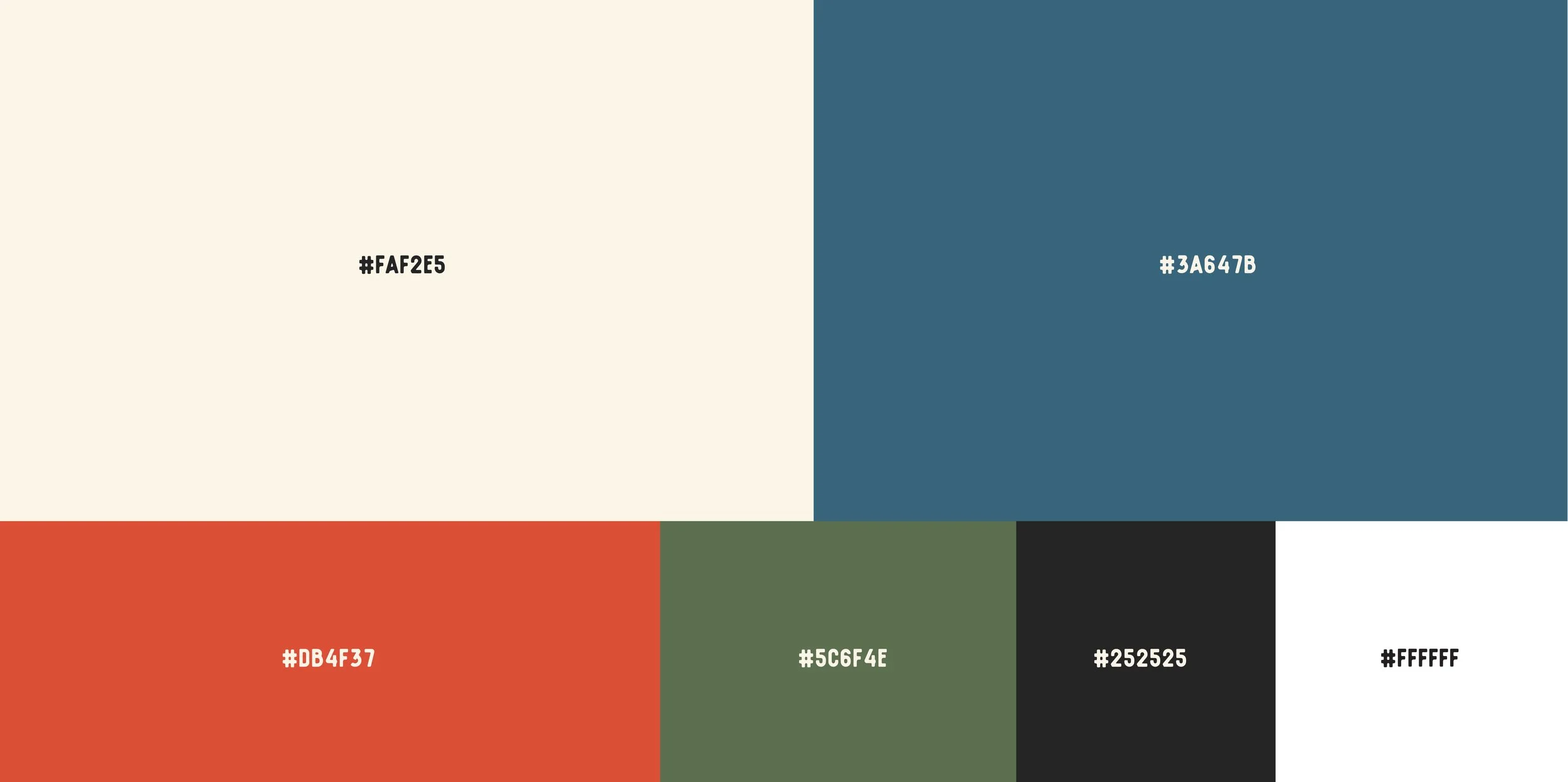
Color palette and typography selection.
-
Brand guide document showcasing all creative assets, strategy and guidelines for future usage.
Timeline: 6 Weeks
The Challenge
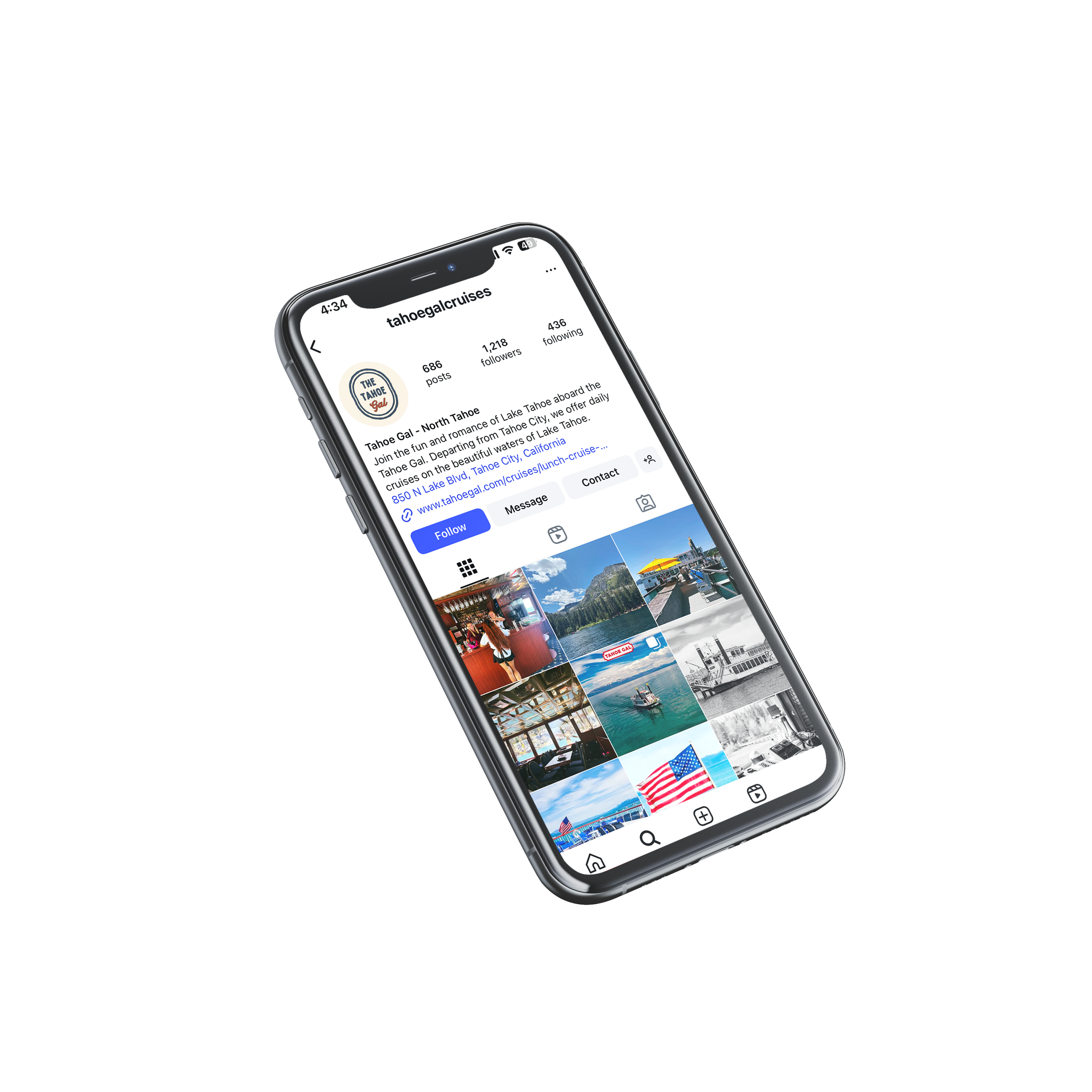
After our initial meeting it was clear there was an apparent lack of direction due to relatively DIY initial brand identity from the previous owners. The biggest disconnect was this underwhelming presence did not build excitement around The Tahoe Gal as a go-to summer activity for a wider age range. Additionally there was no consistency online which led to an unprofessional, unrecognizable and unappealing option amongst competitors.
Step one of the project was to dive into the brand strategy through a workshop meeting. This stage is crucial for understanding a brand's mission, audience and direction. We covered topics such as stylistic preferences, brand personality, tone and messaging, visual media aesthetic and much more. From here I dived into a competitor analysis to determine what other tour boats in Lake Tahoe are doing to ensure we create something original and unique.
Stylistically the client decided on a vintage and summer inspired look that was both inviting and personable. The usage of script and hand drawn fonts paired with chosen colors add to the timeless look we were going for.
