SIERRA CURRENT
CASE STUDY
The Sierra Current - Brand Identity
Overview: Sierra Current is a newsletter based in Tahoe, California. They reached out to me looking for guidance launching the newsletter, and developing branding that speaks to their target audience.
Services Provided:
-
Complete visual identity system consisting of brand assets, strategy and a brand guidelines document.
-
Client discovery and strategy sessions, and moodboard to establish creative direction
-
Logo’s and variations to apply to various different platforms.
-
Color palette and typography selection.
-
Brand guide document showcasing all creative assets, strategy and guidelines for future usage.
Timeline: 4 Weeks
The Challenge
The foundation of Sierra Current grew from the desire to empower both locals, tourists and small businesses in the Lake Tahoe area to connect with their community and support each other in a otherwise transient and high cost of living area.
Throughout out initial discover sessions we identified that due to its non profit nature, this brand should be bold yet also casual and inclusive. Another aspect we landed on is connecting to the heritage of both the area and essence of the community.
After in-depth research, brain storming and our shared moodboard, we landed on a outdoor vintage aesthetic that also gave boldness and excitement to the brand.
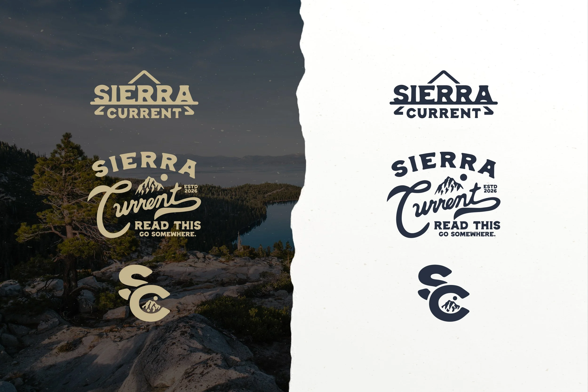
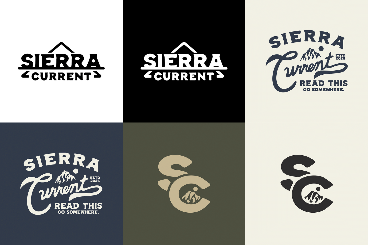
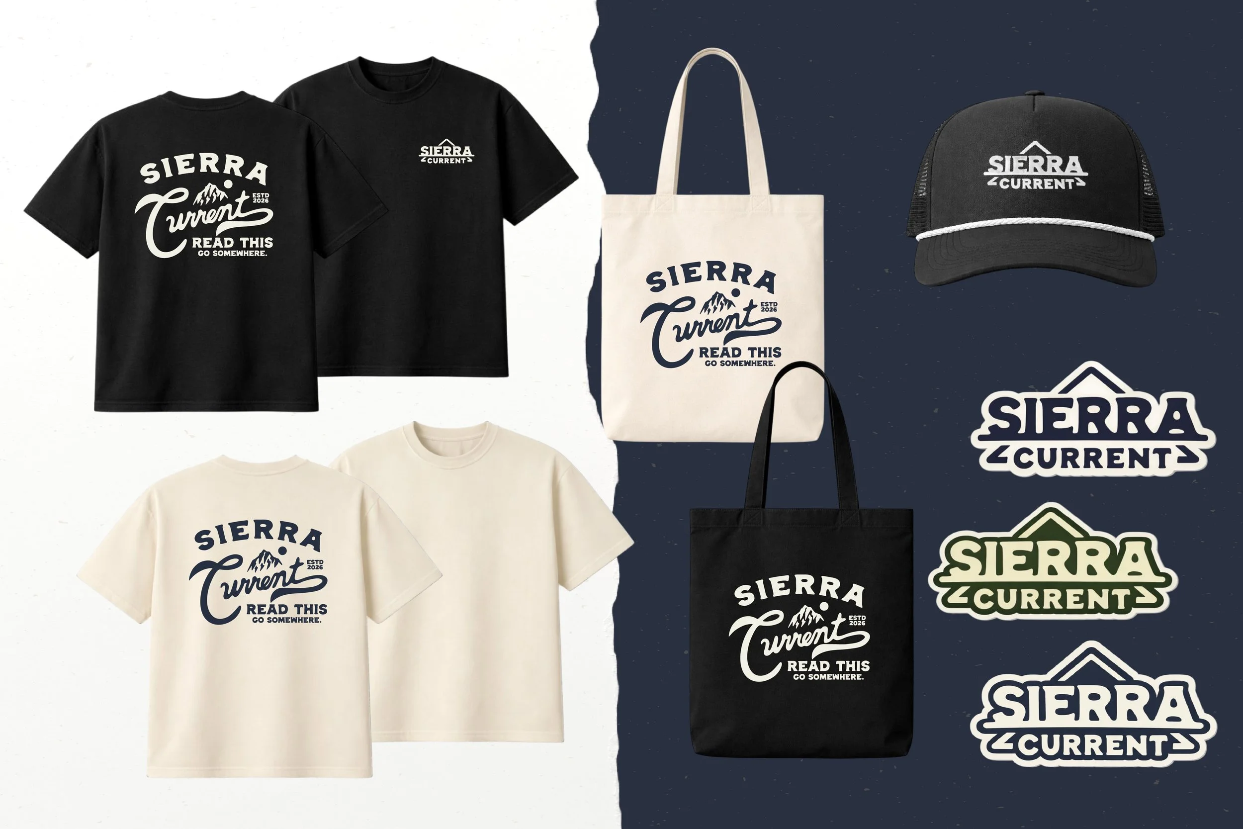
The final marks significance each ties back to different details we identified. The primary logo’s shape speaks to a non literal interpretation of a mountain range paired with a supporting line that both represents water and also old western metal signage. The secondary badge variation was designed to be used in applications such as apparel and physical marketing, allowing for a more expressive design. Lastly our logo mark is a monogram representing the connection we were aiming to incorporate. The uniquely manipulated type along with the mountain and sun within the composition create a uniquely Sierra Current symbol.
